Smart Holmes
Designing an easy-to-use website for IoT and smart home services and education.

What’s up Holmes?
This was a project done at General Assembly wherein teams of designers were paired up with real-world clients. I was paired with another UX designer and we ended up working with a client who was starting a consultation business specifically for smart home products/IoT called ‘Smart Holmes’.

GOAL
The client’s goal was to provide:
Consultation services for customers looking to buy IoT products.
Configuration services for customers who own IoT products but have installation/integration issues.
Our goal was to design a webpage that:
Allows users to contact the client to schedule consult sessions.
Feature articles that the client has been producing.
Create visual identity and branding for the company.
ROLE
For this project I was in charge of
user research
competitive and comparative analysis
design and wireframing
prototyping and testing
My partner was in charge of business strategy, branding and visual design but for the purposes of this case study I created my own version of the visual design.
Constraints
This was a 2-week design sprint. The company was in its very early stages and was not set up to do anything beyond receiving requests for consultations and producing smart home related content. That limited the kind of features we were able to design. But on the flip side it was a greenfield project that allowed us a lot of visual creativity. Our challenge was to find creative solutions for simple tasks.
Research
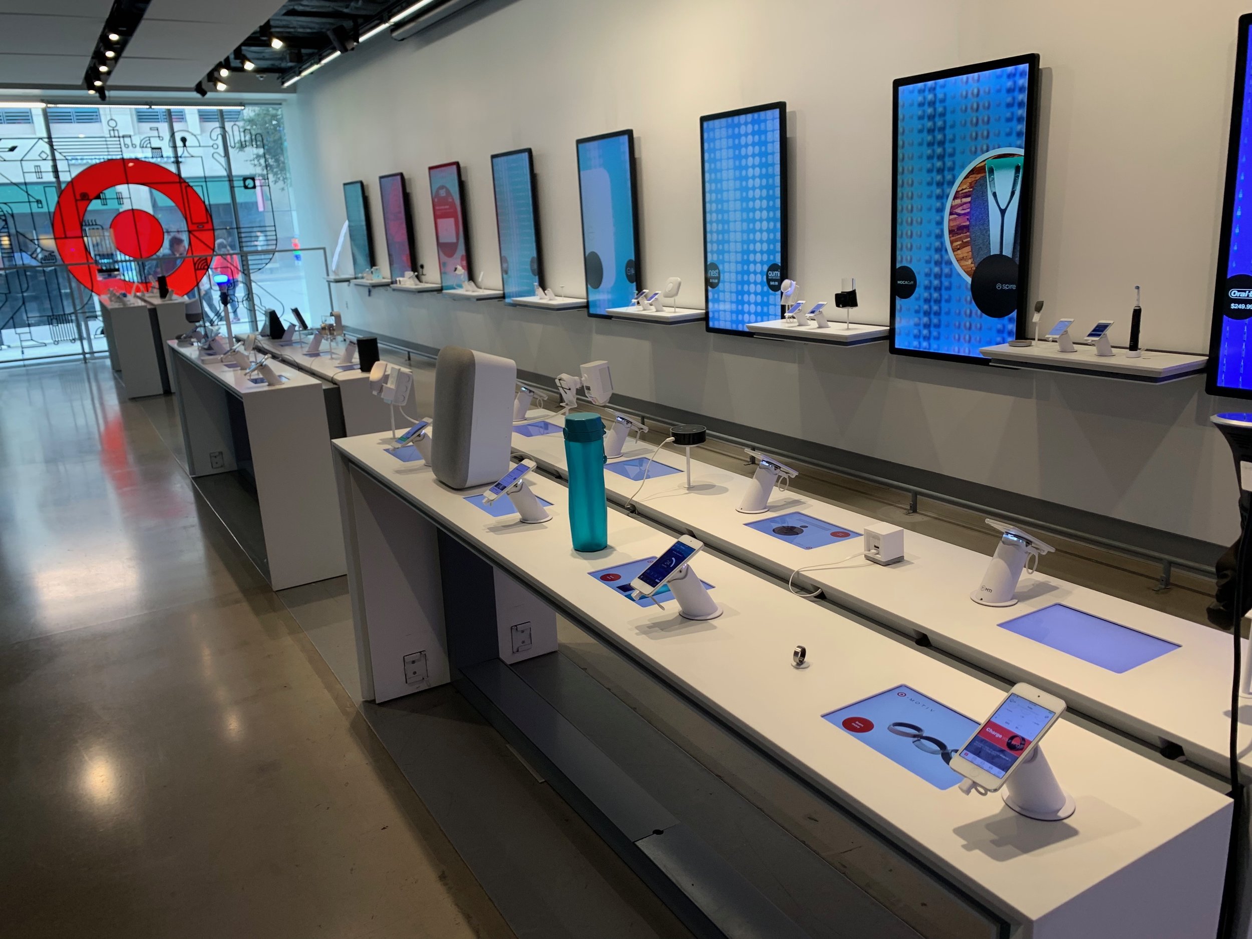
Target Open House
We began our research by visiting the Target Open House, a showroom for smart home/IoT products from all over the world. We learned about the various products on the market and the different companies vying for dominance in this space. This validated ‘Smart Holmes’ service idea as we learned that there are issues when it comes to integrating these products as they are coming from competing product manufacturers.
I also conducted some user tests asking participants to run through existing sites that provide similar services and tell me about their overall experiences, mainly looking for pain points to focus on.

Competitive/Comparative Analysis
I did a competitive analysis of the competition, listing down features on their sites to get an idea of our must-haves. We also looked for gaps that ‘Smart Holmes’ could potentially take advantage of.
Insights
One of the main findings we had was that there was difficulty availing of the consultation services because they were hard to find. Best Buy’s, for example, was difficult to locate as they mainly focus on selling products. There was no easy to find button to sign up for a consult, something our participants would have liked to have.
We also noticed that the one thing competitors didn’t provide a lot of was content such as articles and videos. Considering that our client had already produced articles for the site, we suggested that writing content could be where ‘Smart Holmes’ finds its niche. We also proposed that they avail of affiliate marketing in order to monetize immediately off the written content.
This informed our design greatly. The articles section was to be a main feature. Speaking of features…
Design
Our MVP
Submission form that is easy to find and use.
Articles with affiliate links.
Newsletter. We wanted to include this feature to keep users updated on content and build the user base.
Keeping in mind ‘Smart Holmes’ constraints at the time, we wanted to make sure we were designing features based on what the company was set up to do: receiving requests for a consultation session and creating content for users to read.
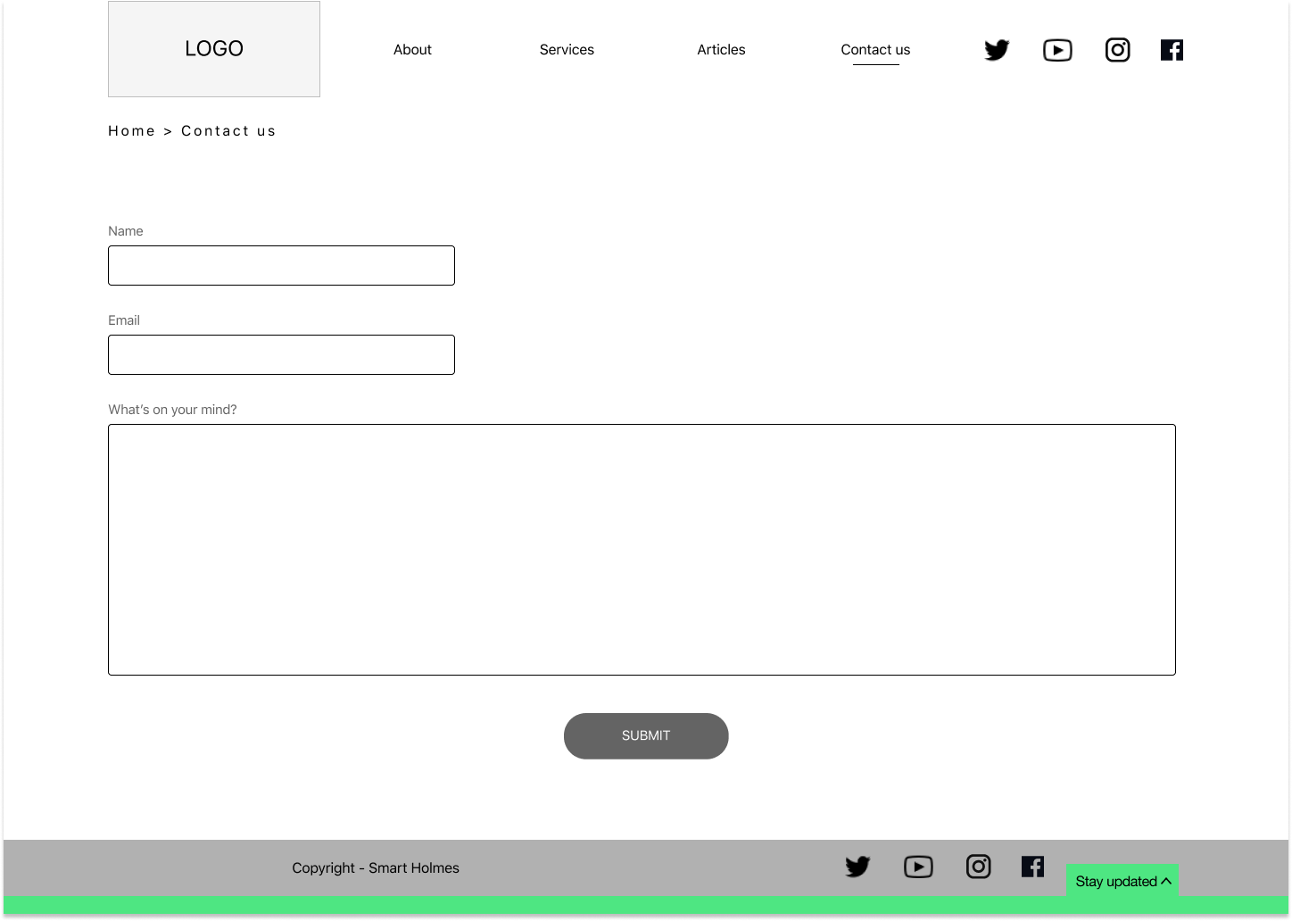
Wireframes
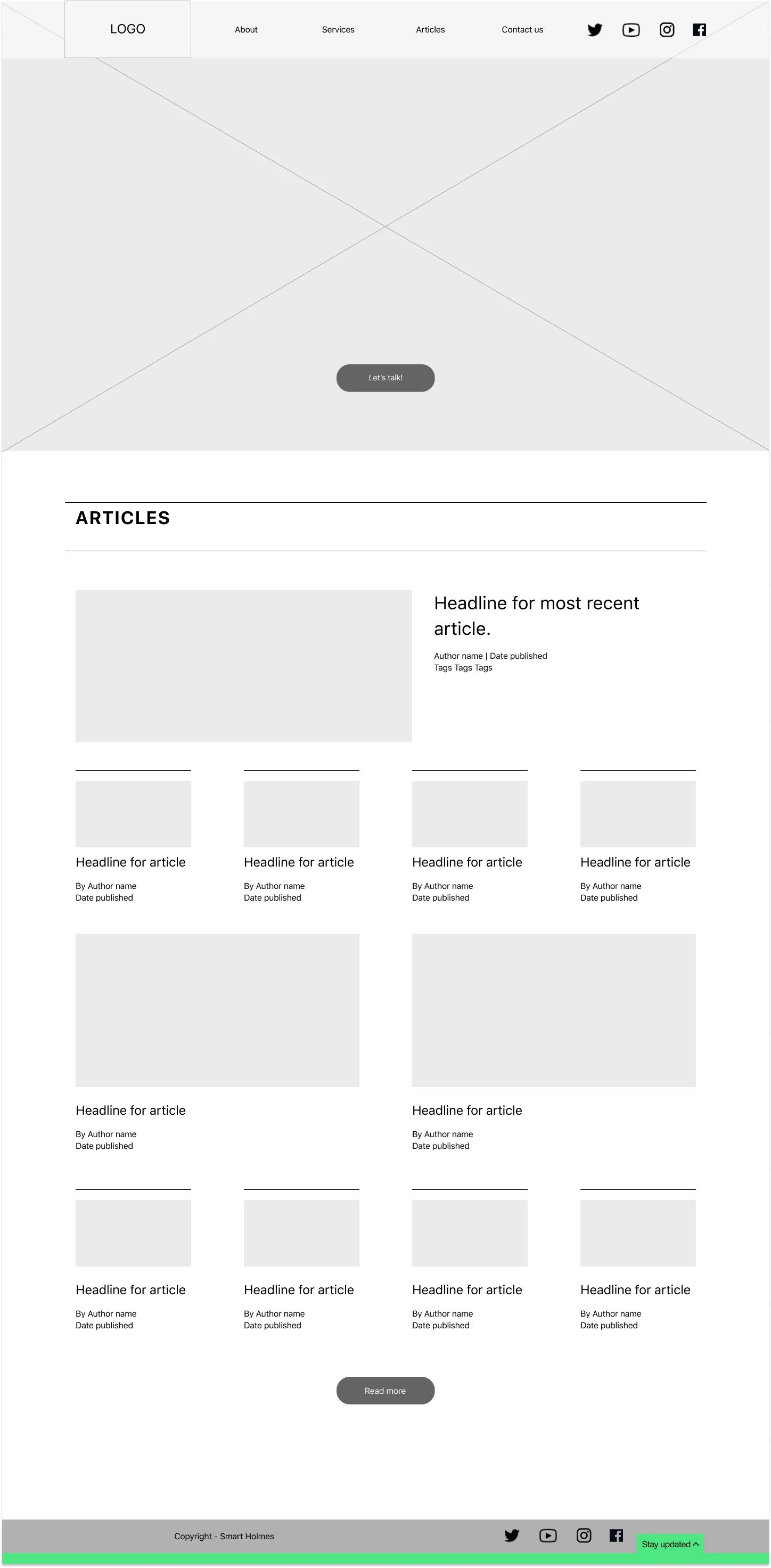
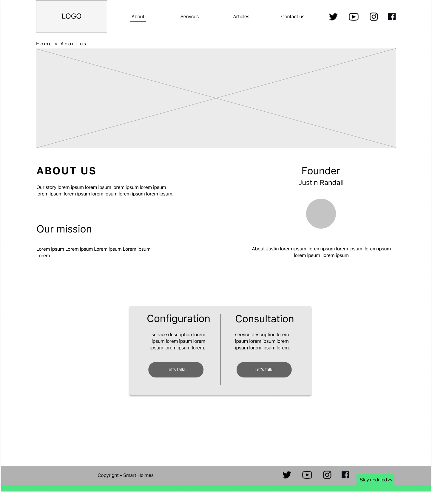
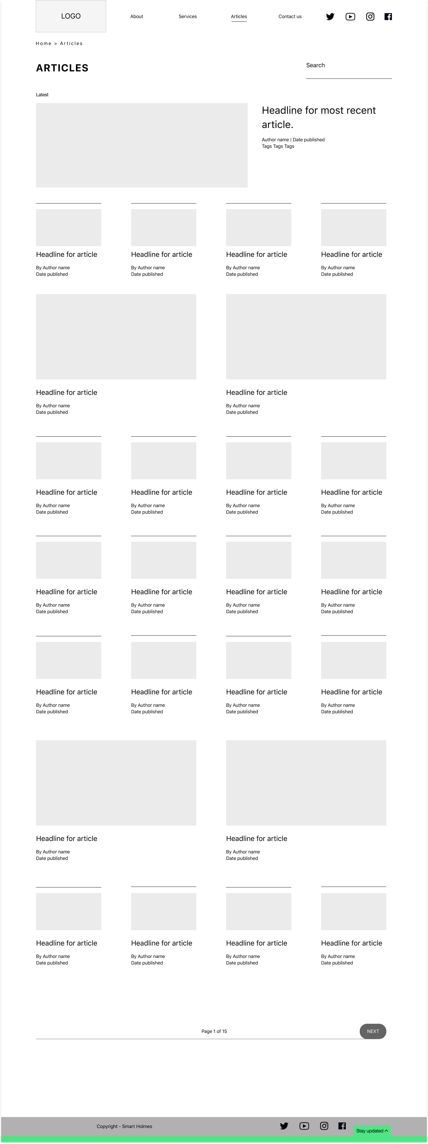
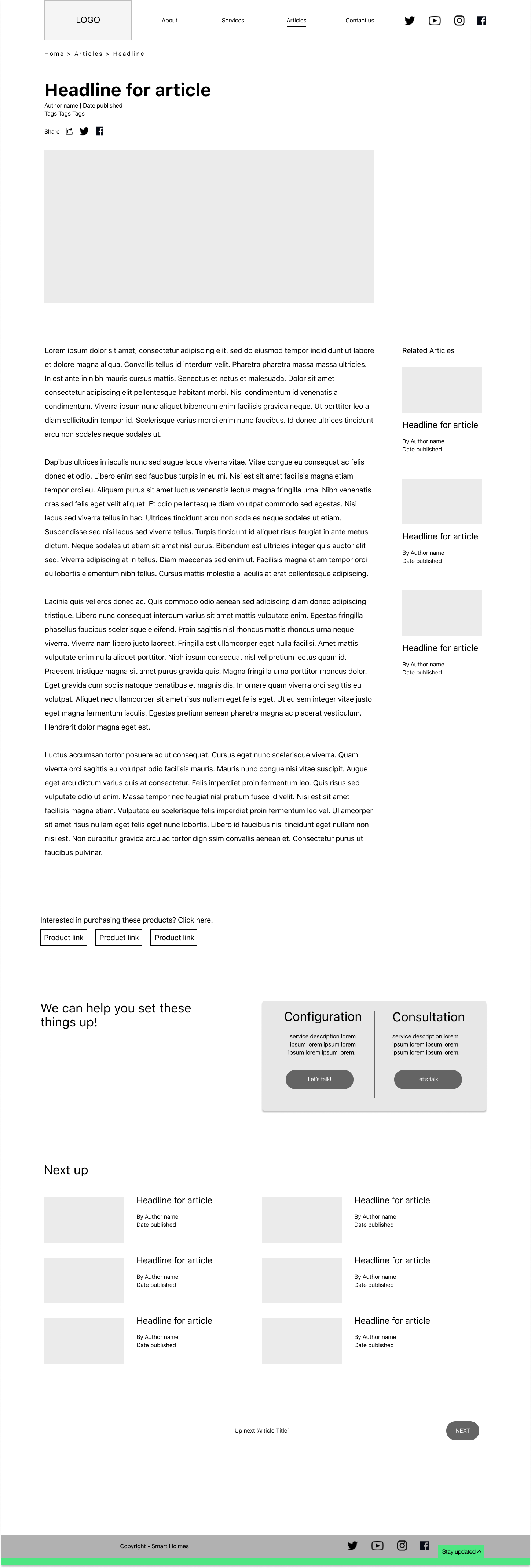
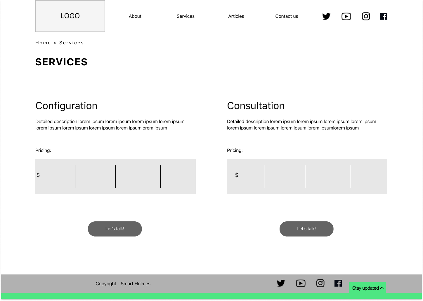
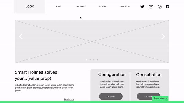
For the wireframes I designed every page for the site with completing the user journey of submitting a consultation request in mind. For the articles section I took design inspiration from various tech media websites such as Wired.com. I wanted ‘Smart Holmes’ content to look and feel more credible than your average blog.
Feature design
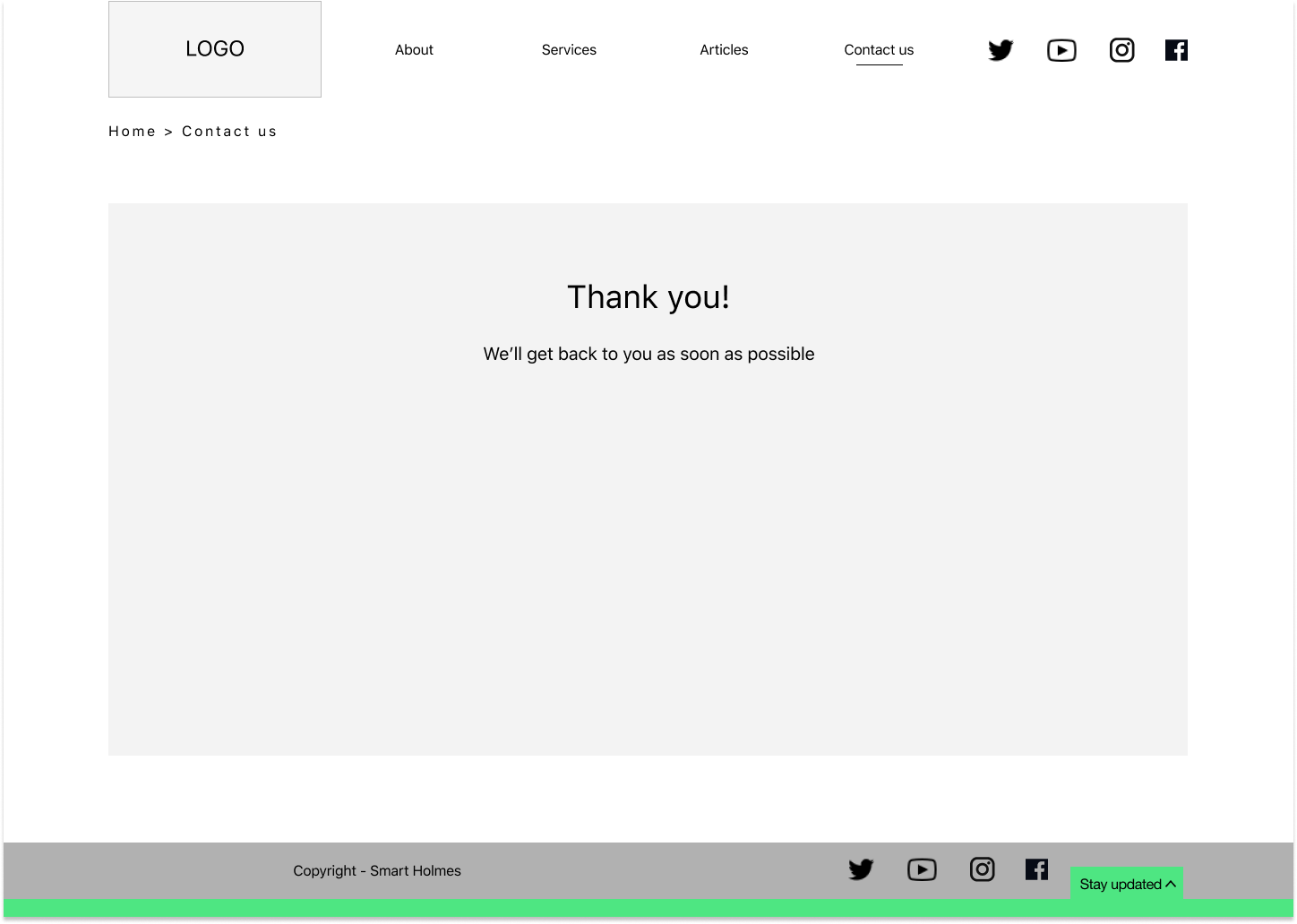
Form
With our MVP in mind my top design priority was making the services visible. A large button right below the hero banner made it easy for users to access the submission form to set up a consult session via a form modal. I also included that button in a number of pages including the ‘About us’ page, and at the bottom of every article.
The form design itself includes a feature wherein users can input the types of products they have and populate a list. This will help ‘Smart Holmes’ organize requests and track data.

Newsletter
One thing we found with users is that they didn’t like pop-ups asking them to sign up for a newsletter, especially when they were in the middle of reading an article. We found an elegant solution for that by designing a drawer that users access via a tab at the bottom of the screen. It scrolls with the page so that it is ever present but never in the way of anything important, making it easy to find but also accessible at the convenience of the user.
Visual Design
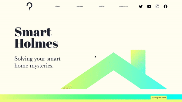
For the branding and visual design, our client expressed that he wanted the company’s look, feel and tone of voice to be friendly and interesting. That inspired the color palette to be on the warmer side. From there I wanted to focus on the witty wordplay of ‘Smart Holmes’, using the Sherlock Holmes name recognition and combining that with visual elements associated with smart home technology. Mixing a little classic, literary style with modernity.

‘Smart Holmes’ style guide

Homepage high-fidelity screen
Type
I was inspired to use typography that is reminiscent of classic literature; serif fonts. ‘Abril Fatface’ provided the Display text while ‘Baskerville’ (of course) provided the Headline and Body text. A sans serif, ‘Source Sans Pro’ is used for contrast and a more modern feel in the buttons, links and sub-headings. A little old with the new.
Color
Continuing the ‘old book’ theme, I incorporated a light yellow in the background of the banner. But ultimately this is a smart home product site so it was important to use modern elements. I used warm yellow-green-teal gradients in a simplified house graphic in order to give it a contemporary feel and communicate ‘smart home’. Also, its a play on smart light bulbs and how they’re able to transition from hue-to-hue.
Logo
Utilizing the Smart Holmes wordplay, I wanted to mesh a ‘?’ and a lightbulb, using their similar silhouettes to have a double meaning.