Product page templates
Creating page templates for a B2B microchip design company
GOAL
While working on a design system for the company, I needed to create easy to use templates for chip design products with long, highly technical content, that are still user-friendly and visually appealing.
ROLE
My role as Sr. Web Designer is creating the wireframes and responsive high-fidelity mockups based off of our design system, while accounting for various use cases in terms of different types of content. Often having long, intimidating content, new (and old) pages needed to fit in to the newly established design system. I designed these page templates to do that, to create consistency and a good user experience across all pages.
Finding the common sections across different pages
The website has a multitude of different pages, most of which are informational product pages across a few different product groups and product categories, each of which are run by different business groups with different structures to their content. I’ve had to handle pages for new product launches, the migration of newly acquired products into our website’s product pages, and the updating and migration of older pages into our newly established templates.
When all of these had been created without a template, this meant my having to assess as many pages as possible and list out all the different sections each page had, and see which were the most common.
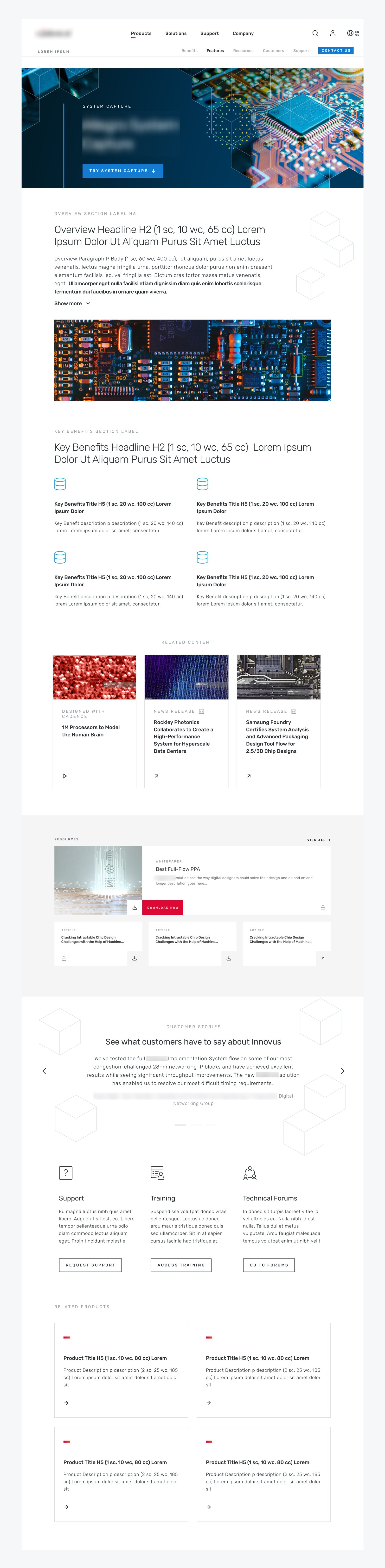
Product page comparison
After scouring the site, the most common sections appeared to be:
Overview
Key Benefits
Features
Resources
Related products
One section at a time
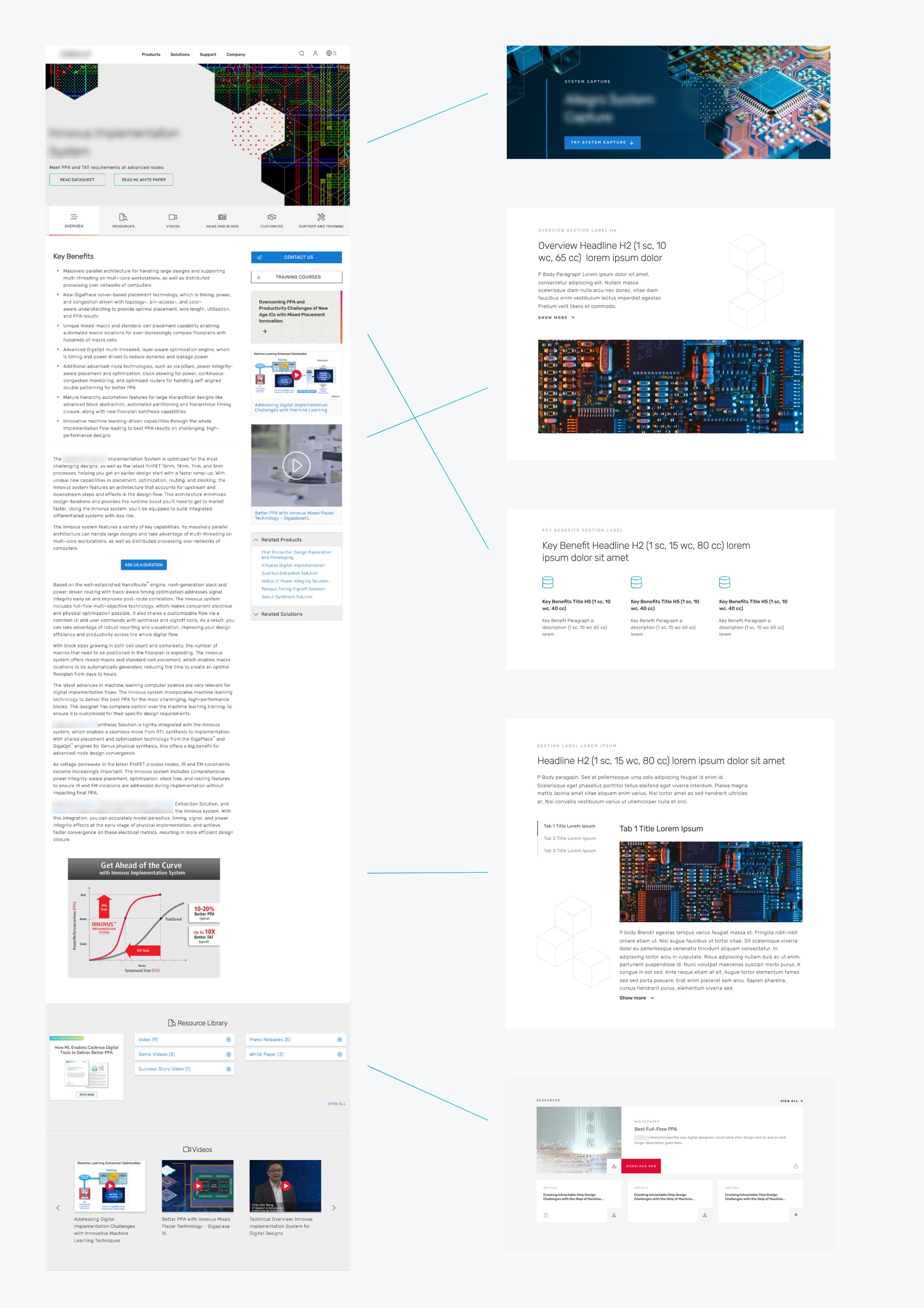
These aren’t typical e-commerce product pages, instead they’re meant to be informational, marketed to engineers, and intended to generate long leads. Each section needed to be designed to serve its specific function well, basically creating a hierarchy on the page.
We also decided to have the content span a limited area instead of having it go edge-to-edge. We had the left and right most columns act as padding. Limiting the width of the content to 10 columns instead of the full 12 allowed for more breathing room, as well as reducing eye strain.
Overview section
Each page began with an overview section; a quick summary of what the product is and what you can expect to learn from the rest of the page. It’s meant to be a short, easy to read introduction, one that a user can read and decide if they want to continue down the page.
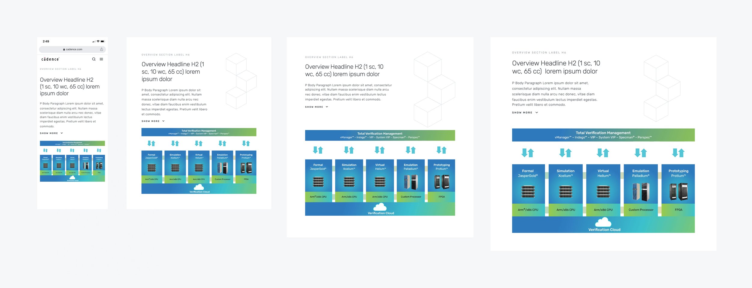
Overview section, responsive
More often than not, the content provided by our stakeholders was on the longer side. To keep it a length that’s easy to digest, I opted to use a show/hide feature after the first paragraph. That way the content wasn’t removed, instead the user had control if they wanted to read more.
We also wanted to have this section be appealing to get users to maintain interest. So I designed it to have an image to be paired with the text. If no image was available, we used some branding elements; cubes graphic that were present in a lot of the company’s branding.
Key benefits
Page content often had ‘Key Benefits’; typically a bulleted list of quick descriptions highlighting the benefits of using the specific product.
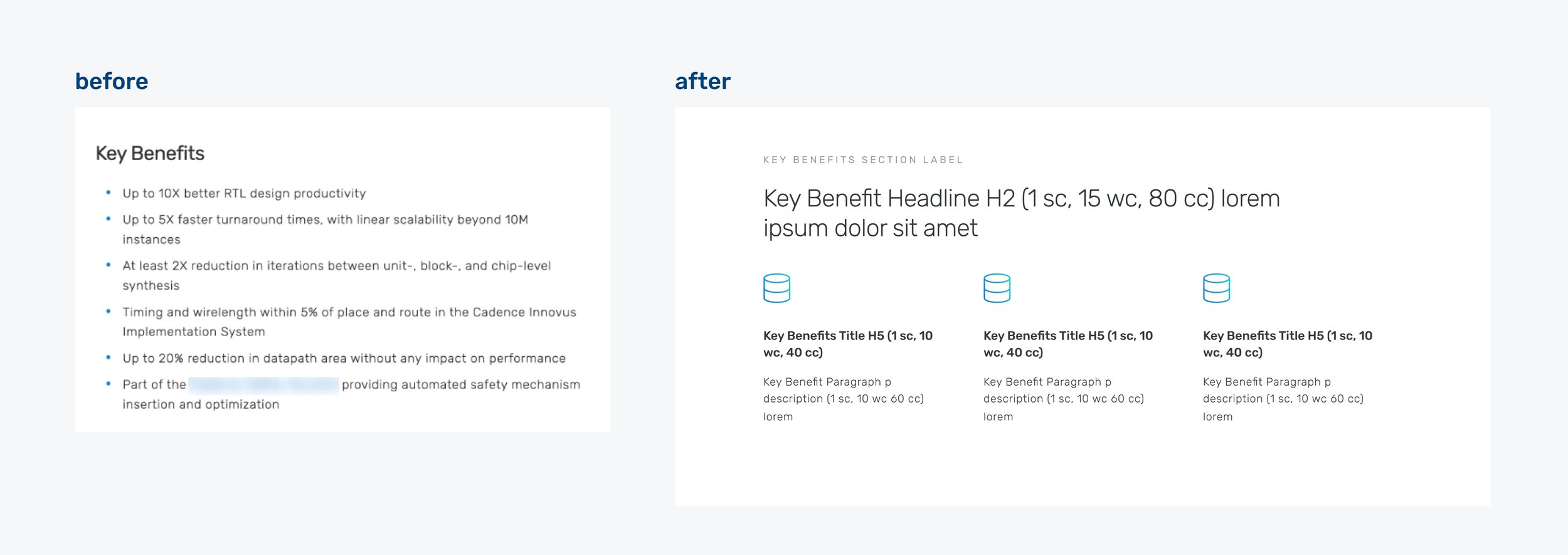
Instead of bullet points, these Key Benefits were designed to stand out more as individual text blocks. I paired them with icons to support the idea of each benefit with a visual representation. We put them in a row to group them, but with enough spacing to help each one stand on its own. Each key benefit spanned between 3-5 columns depending on how many were in a row. This allowed for this entire section to stand out as a quick, easy to scan, group of short key points.
Features
The features section was a challenge as this was often the bulk of the content for each product page. Here, each feature of the product was described in detail. These features, one after the other, made for a long scroll, and an intimidating amount of text. Like with the overview section, we wanted to find a way to allow the user to read the content without it being overwhelming.

Utilizing tabs, we created a section that the users could easily read each feature individually, while reducing the amount of space they took up on the page.
Resources
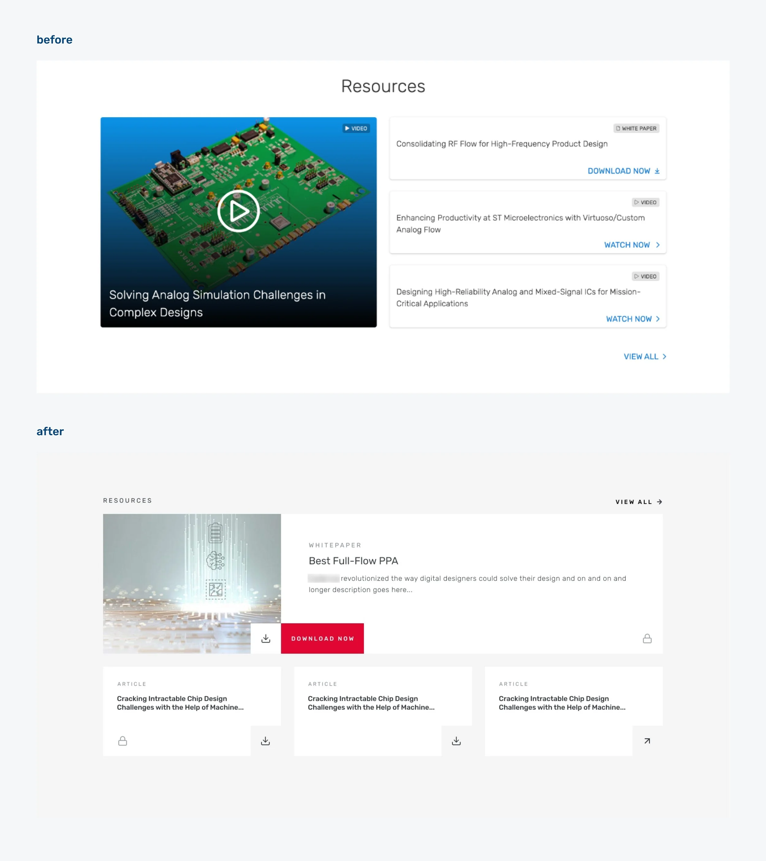
Each page also provided a lot of additional resources to help the user learn more about the products with videos, white papers and blog posts on the subject matter.
Initially, I had designed these elements as cards with text overlaid on images. We eventually wanted to update that to improve accessibility. So I separated the image and text and created cards that were not only clearer and more accessible, but allowed for more information. This direction was useful for card/tile elements that had an image.
Related products
Pages often had related products in a dropdown on the right-side rail of a page, usually somewhere midway down. This location was a bit cluttered and disorganized. We wanted to be able to display related products to cross-sell but ultimately we wanted to make sure the user focused on the end goal and not get distracted. So a new dedicated section was created and put at the bottom of the page where users can consistently find it.

Updating this, I wanted to emulate more common e-commerce practices and have each related product be an individual card instead of a list hidden in a dropdown.
Putting it all together
These sections and their individual components are flexible enough to be used across many different pages, with different lengths of content.
I also redesigned common sections like the promos/ads that were previously on the right-side rail, a customer testimonial section, and the support section, all of which are located towards the bottom of the page as to not distract from the main content.
Putting it all together with information hierarchy in mind, the end result was a malleable template that could be used across multiple business units, and features the content in the best way possible.