Saranghello
From an online music store to a K-Pop community hub
GOAL
To create a brand for a new K-Pop music retail business that is memorable and captures the essence of K-Pop
ROLE
My role is creating and managing all aspects of the business’ brand, including:
creative direction
creating the brand guidelines
designing the logo and other brand assets
crafting the look and feel for the business across various platforms
The Bay Area’s Need for K-Pop

BTS and Blackpink
K-Pop itself needs no real introduction. By this point, you’ve at least seen or heard of BTS or Blackpink, the current standard-bearers for the global phenomenon that is Korean Pop Music.
SarangHello was started in early 2020 by three K-pop fans who were baffled by the fact the San Francisco Bay Area, one of the largest markets in the world with a historically rich Asian-American background, had absolutely no K-Pop stores.
On one hand, a physical music store sounds like something out of the early 2000s, now nearly extinct in the Spotify era outside of specialty shops. On the other hand, the East (Japan, Korea and more) have doubled-down on physical media, producing them as collector’s items with inclusions along with the CD like artist photobooks, posters, stickers, randomized collectible photo cards and more.
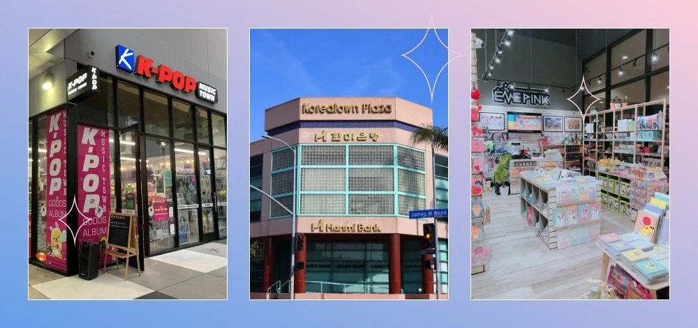
K-pop stores and LA’s Koreatown Plaza
LA’s Koreatown (and other cities across the US) features a multitude of K-Pop specialty stores, and with the genre’s insane rise in popularity over the past 5 years, the need for one in the Bay Area was an obvious one.
Be that as it may, this was early 2020, and life decided to to throw one of the greatest curveballs we’ve ever seen: the pandemic. As much as we wanted to open in San Francisco, we had to start solely online, which was an opportunity to grow the business, and the brand, digitally first.
Hello love! The meaning behind the name
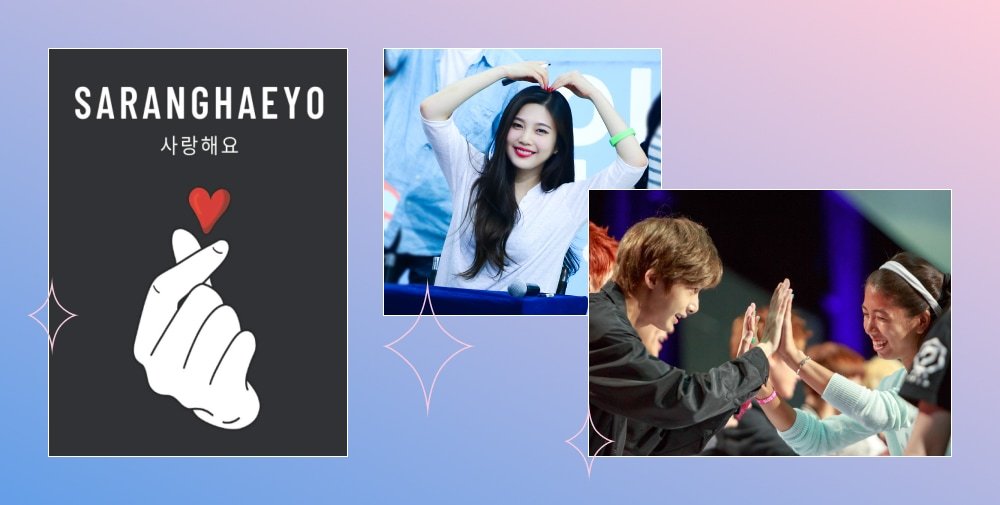
The direction for the branding all started with the name. In trying to come up with one, I wanted to hone in on strong Korean iconography, recognizable words and imagery that any fan of K-Culture would recognize. ’Sarang’ is the Korean word for ‘love’, and ‘Saranghaeyo’, is ‘I love you’. SarangHello is a play on that phrase; a welcoming greeting of love.
Beyond the bombastic sound production, dance choreography and visuals, what makes K-Pop special is the love between the artists and their fandoms, and within the community itself. It’s unlike anything else in entertainment and that’s something we wanted to be a core focus of our business, not just the selling of the music and merchandise. Love for K-Pop is at the center of this business and that’s represented up front with the business name.
Our mission:
to spread the love for K-pop and make it accessible to fans, especially the Bay Area
Brand strategy:
we’re fans just like you, let’s support, celebrate and enjoy K-pop together
Brand voice:
friendly, inclusive
building the brand’s visual identity

K-pop hearts
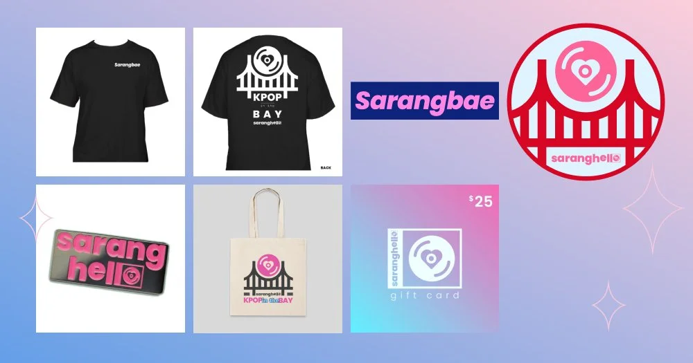
With the name and our mission in place, the visual identity quickly took form. There was only one the thing that was an absolute must-have: a heart. ‘Love’ is the first word in our name after all. Hearts not only universally represent love, but K-Pop artists made posing with hearts almost synonymous with the genre. That expression of love using that shape needed to be a part of our brand.
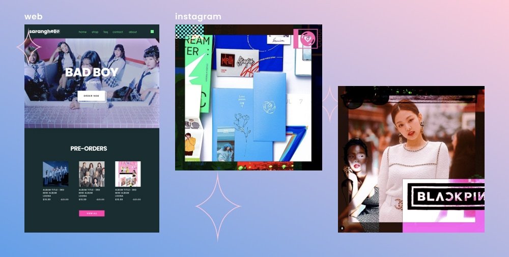
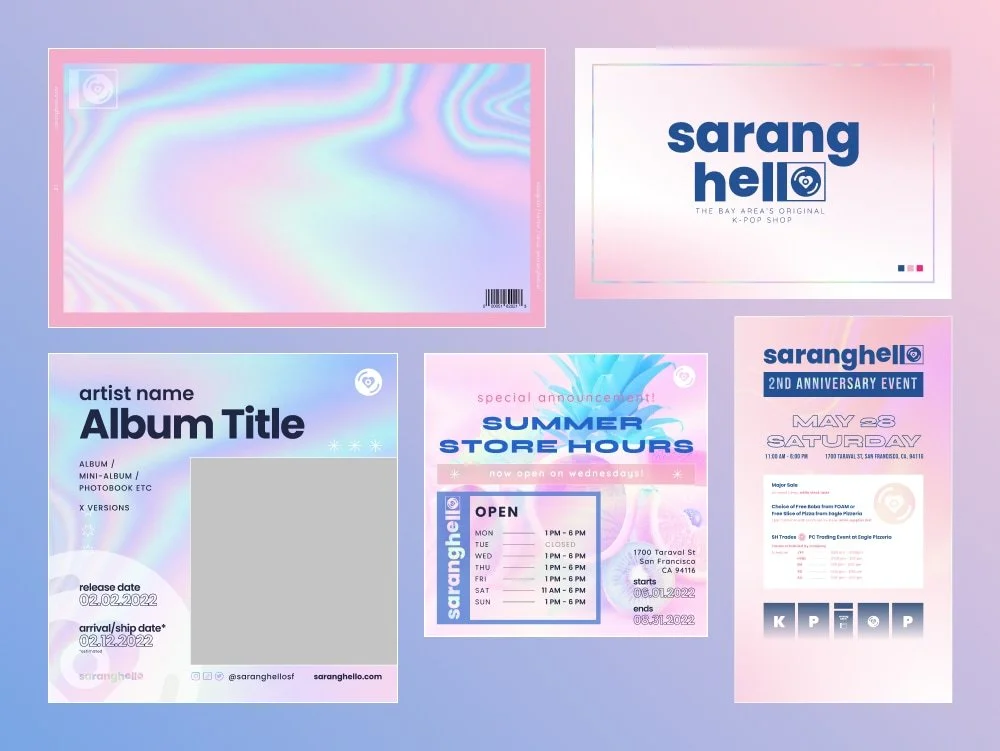
The logo/wordmark
I played around with a number of ideas featuring hearts; the K-Pop finger hearts, trying to form a heart with the letters, a cute illustration with hearts… but nothing looked strong or memorable enough. I then decided to go simple. While maybe incorporating a logo into a wordmark isn’t necessary, I was looking at the shapes the word ‘saranghello’ formed, I wanted to use the roundness of the ‘O’ at the end and see if I could make it a CD, the main product that we feature. The lowercase ‘L’ next to it could be used as part of a CD case. That was pretty successful and our hybrid logotype was born. Most importantly, it was legible and scaled well.
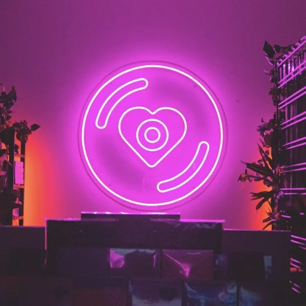
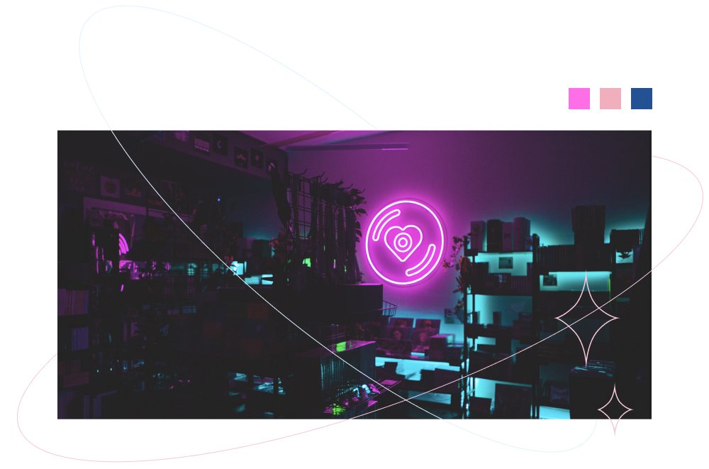
SarangHello neon sign
Of course it’s not just a CD, it’s a K-Pop CD. So the heart found its way to the center of the disc. I was most happy with how it reminded me of neon record shop signs you would see on a cool street, something we incorporated into our store experience with a neon sign. The CD with a heart ended up being quite iconic, and became the centerpiece of our brand’s visual identity.
The familiar font
The typeface used for the logotype ‘Poppins’ is used quite often (it certainly helps that it’s free). As it turns out, this was the perfect typeface to use for our brand for other reasons as well.
As a new brand looking to build trust in a field where all products are imported and customers can easily get scammed, I wanted to have SarangHello feel familiar and trustworthy, while being modern and cool at the same time. I looked at our competitors as well as brands within the music space, and felt like a clean, simple and strong font like Poppins was exactly what we needed.
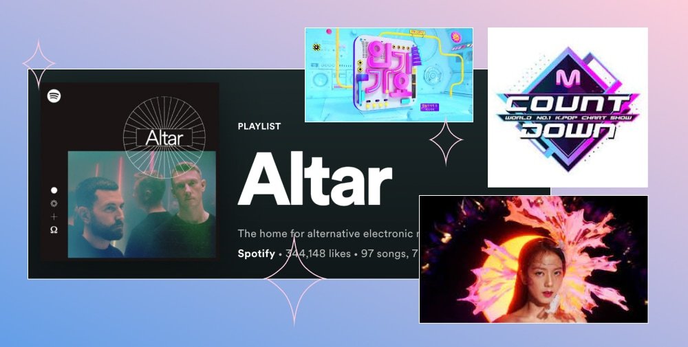
It also closely emulated one of my primary sources of inspiration: Spotify. They’re as ubiquitous to music listening as Starbucks is to coffee. So to feel familiar as a modern brand within music, I felt like drawing inspiration from Spotify’s wonderful design system made sense.
Color story

The brand colors were also decided with trends at the time in design, especially dark mode, but mostly was inspired by the escapist appeal of the neon-soaked music videos that served as, for many K-Pop fans, the medium that got them into K-Pop in the first place.
Like mentioned earlier, looking at Spotify as a main source of inspiration helped bring about a dark background with pops of neon motif.
A K-Pop fan’s happy place
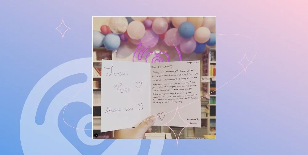
SarangHello customer letter
As the pandemic restrictions began to open up, we were able to go from an online only store to opening our physical location in San Francisco. The response was breathtaking. Customers came in droves, not only coming from far and wide, but willing to wait for hours. They were genuinely thrilled to be shopping with us, happy to finally have a K-Pop store of their own. They came bearing gifts and messages of support, and all of a sudden it dawned on us. We were more than just a store. As many of our amazing customer’s would say; we’ve become their ‘happy place’.
Brand refresh: from dark and cool to bright and happy
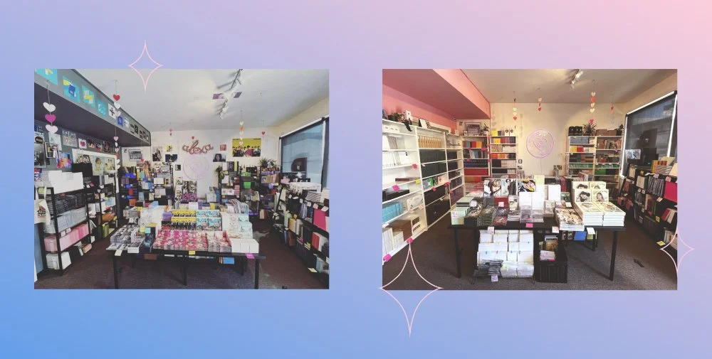
Our initial inspiration was to emulate the cool, neon aesthetic of music videos. But in realizing what SarangHello meant to our customers, I wanted to do a brand refresh and focus on the softer side of K-Pop. I wanted to give the brand a warmer, more welcoming look and feel. This is currently being updated across all channels including our social media, and even our in-store experience. The new look better reflects who we are, and what mean to our customers.

One of the main focuses of the refresh was how to create the softer, more welcoming look and feel but still represent the fun, futuristic vibe of K-pop. I drew inspiration from the ‘Holo’ aesthetic which typically uses shiny, iridescent and reflective or holographic imagery. These images usually contain light pastel backgrounds that reflect off into rainbows. I thought these also tied in well with the reflective back side of a CD. Pastel pink and blue for our color palette give a dreamy, comfy vibe.
Our business now proudly has around 30k followers across Instagram and Tiktok in a little over a year. We’ve been featured in the SF Chronicle, BuzzFeed K-Pop, and even on Korean News.
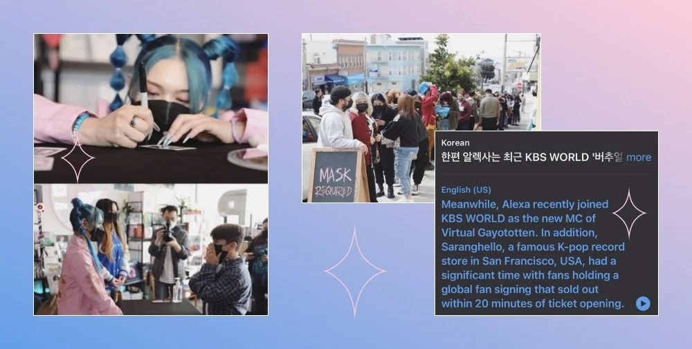
K-Pop idol and American Song Contest Winner AleXa fan-sign event at SarangHello
But most importantly, we’ve become a community hub that hosts K-pop events such as fan-meetings with K-Pop artists, K-Pop themed parties, and card trading events. In fact, we’re hoping to expand into doing events full-time as a new branch of our business, to continue growing and serving our community.
We feel like our brand represents who we are and what we do. Like our logo suggests, love for the K-Pop community is at the center of it all.